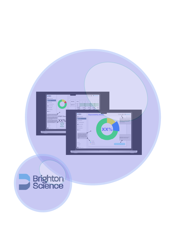
OVERVIEW
Brighton Science exists in the space of measuring surface readiness for bonding, adhesion, and coating systems. Like any piece of equipment used to take measurements, The Surface Analyst (the hand-held measuring device built and sold by the organization) requires occasional testing to ensure that it’s meeting the requirements necessary to fulfill its function.
THE OPPORTUNITY SPACE
The devices are tested on two major concepts: Repeatability (the amount that the same person can receive the same measurement using the device) and reproducibility (the amount that someone else can receive the same results with the tool). The combination of these results is combined into the Gage Repeatability and Reproducibility, or GR&R.
Results from testing the devices are compiled and the data is entered manually into an Excel spreadsheet. Those sheets are then submitted for review. As it stands now, there is no way to get an overhead view of the complete test results (the tests only being deemed complete once all of the samples have been taken and each operator has submitted those results), and the ask of the client was to create a multi-experiment results view so that those viewing results can, at a glance, determine the effectiveness of the experiments. There was also to be some thought given to the direction of generating those results to be sharable to others.
My Recommendations for Solutions
The clearest solution presented itself in a visual element such as a graph. We encounter them often in everyday life, and therefore they spring to mind as an effective and easy-to-understand way to present information. It could also prove to be helpful to be able to break that graph down slightly to understand where the overall number comes from.

IDEATION
The process began with a request brief from the client and was followed up with a stakeholder meeting to hear their requests in their own words. Sketches were made and submitted to get some feedback on what worked for the client and what didn’t.
The client provided timely feedback and we made some alterations based on what was said. They indicated which concepts they would like excluded and made mention of which ones specifically they were interested in.
I worked alongside a few others on a team to determine which design concepts best met what the client was thinking. To help ideation, we made a Kano board as well as a user journey map to determine what was already working along the way to ensure that we were falling in line with what this particular group of users were already used to seeing.
In the end, a simple graph structure with access to information being broken down was the way to go. The client was clear that they wanted only so much information at a time, but also didn’t want users to experience click fatigue as they made their way through the data flow.
Learnings & Impact
This project asked the question “How can you provide more information without providing too much at one given time? Brighton Science had a very specific ask: To have the overall results of their product test available at a glance, and in the future, they may choose to build out on what’s already been started. The challenge is always the want and desire to do more than is expected or ask, and on this project, I learned how to stay within the constraints of a client’s request. After all, I’m filling a need, and especially when the need was so specifically given, I learned how to give a very friendly, very approachable look to something that contains a lot of data in a readable way.


